

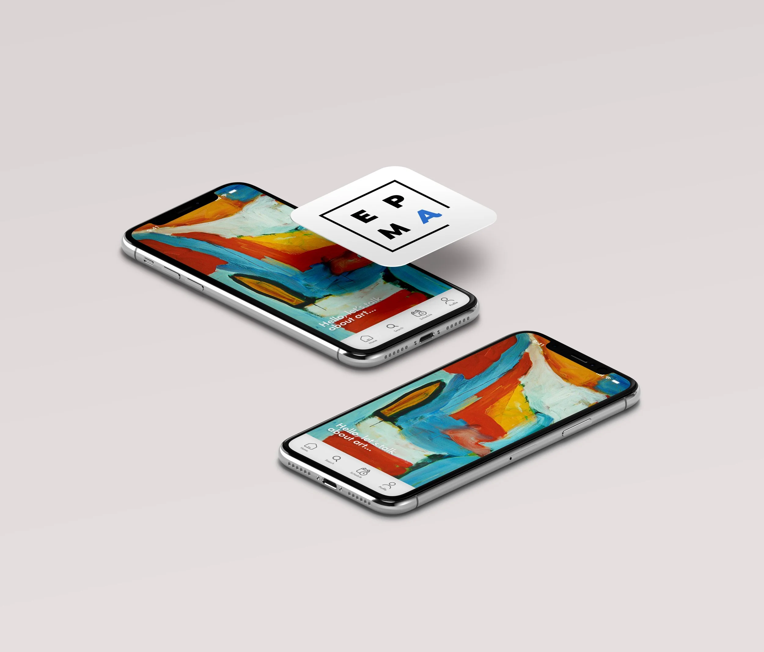
Project Brief:
The local art museum lacks a digital presence, making it difficult for visitors to schedule visits, check hours, and learn about exhibitions. We propose designing an intuitive app to provide easy access to this information, enhancing the visitor experience and fostering a stronger connection with the community.
Problem Statement:
The local art museum doesn’t have an app nor a website where patrons or visitors can schedule their visits, review the museum hours and know more about the art installations or events.
Goal Statement:
The goal is to create an app that will allow the users to schedule visits through the app which will affect patrons who need to call the museum directly to check their availability and information. By Letting users schedule their own visits and skip calling the museum by phone and save that time. We will measure effectiveness by tracking amount of users and visits scheduled through the app.
Competitor Analysis
In my assessment, I focused on analyzing three key competitors, both direct and indirect. I aimed to select businesses within the art world, whether they were art museums or art-related apps. However, due to the limited number of art museums with apps, I expanded my criteria to include other similar apps.

User research summary:
The main problem the users are facing is that the museum of art does not have a responsive website where it shows the current exhibitions and future events. The pinpoint the users are experiencing is that they do not have time to call the museum and ask about the events, or that’s an activity they would like to avoid. Another thing is that they would like to have access to the events calendar, that way they can organize their time.
User pain points:
Users don’t like to call the museum, so instead of a call button we can also add a chat box in case they have any questions.
The users are having a hard time finding the event dates and saving those dates in their calendar, so in the design we can include a plugin that can go directly to their personal calendars and save the date and include reminders.
Users can’t find the current art exhibitions, so in the website we can create a special section with all the information of the permanent and temporary exhibitions.
Users are frustrated because there’s nowhere they can schedule a private visit, so in the design we will add a specific section for Patrons where they can schedule or cancel a visit.
User personas and user mapping
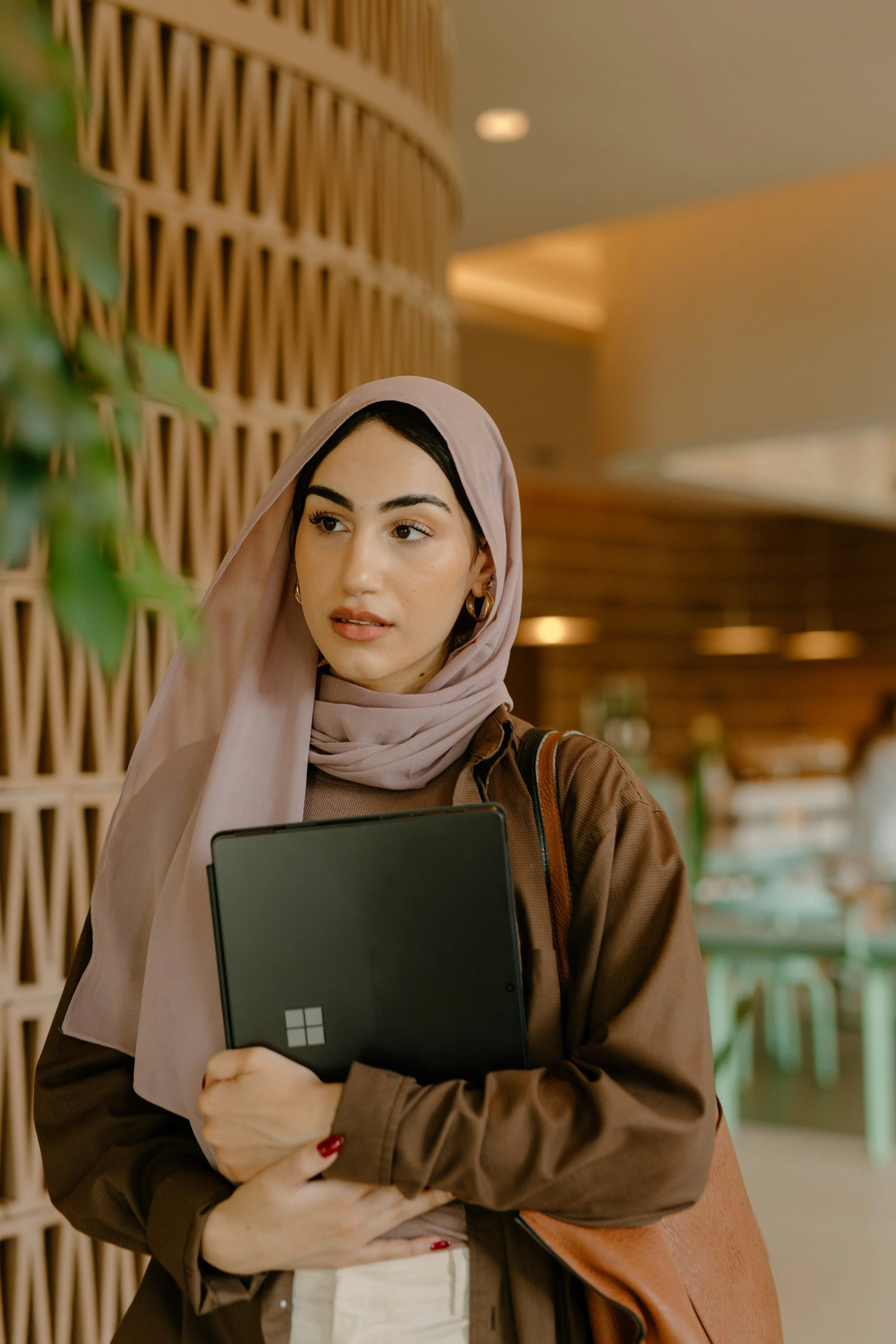

Andrea/age 32
Andrea has a B.A. in Art and it’s a patron. She is always looking for new art events at the museum, to do networking. She also has a lot of clients from other countries, and she likes to take them to the museum to promote local artists work. The problem is that the museum doesn’t have a responsive website, and she doesn’t know where to schedule a visit. It happened before were she took a prospective buyer to the museum but she didn’t had a visit scheduled so they had to leave.
Rafael/age 41
Rafael lives in a small apartment with his partner and his work schedule varies depending on the project. When he has free time, he likes to go to museums and see any new art exhibit since that's where he gets inspiration from. Sadly, he missed the last two temporal exhibitions because he couldn't find anywhere to check the dates.

Cassandra/age 25
Cassandra is a local artist that is always looking for events where she can do networking to promote her work. The problem is that there’s no place where she can be aware of future art events in the museum and she has a hard time scheduling her free time around it.
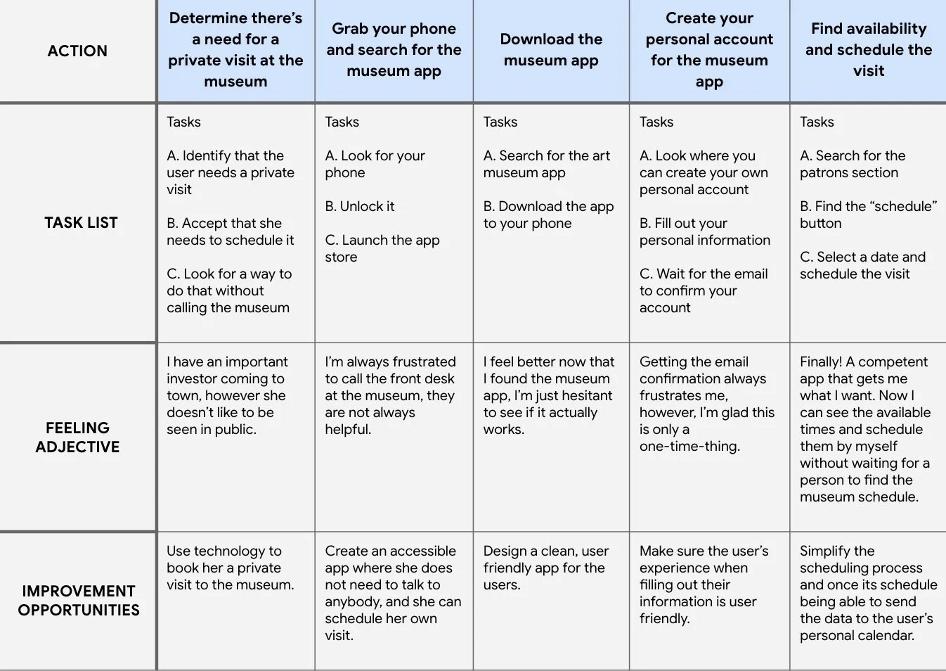
Mapping out Andrea’s user journey revealed the benefits of creating a responsive easy to use app to schedule museum visits. With this information I was able to create the paper wireframes and the Lo-Fi.
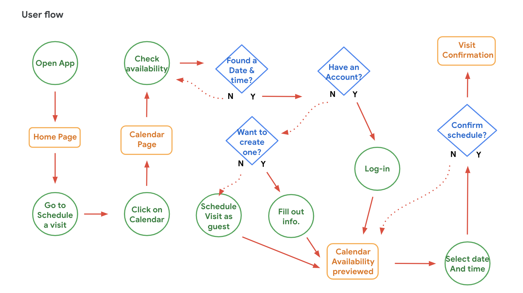
Once that part was completed, it was time to create the user flow experience. That way it was easier for me to start working on the wireframes.
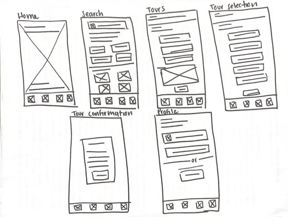
After conducting research and a rapid prototyping session, I curated the most promising features from various sketches and integrated them into a cohesive final sketch. With that stage finished, I proceeded to digitize my wireframes using Figma to continue the project development.
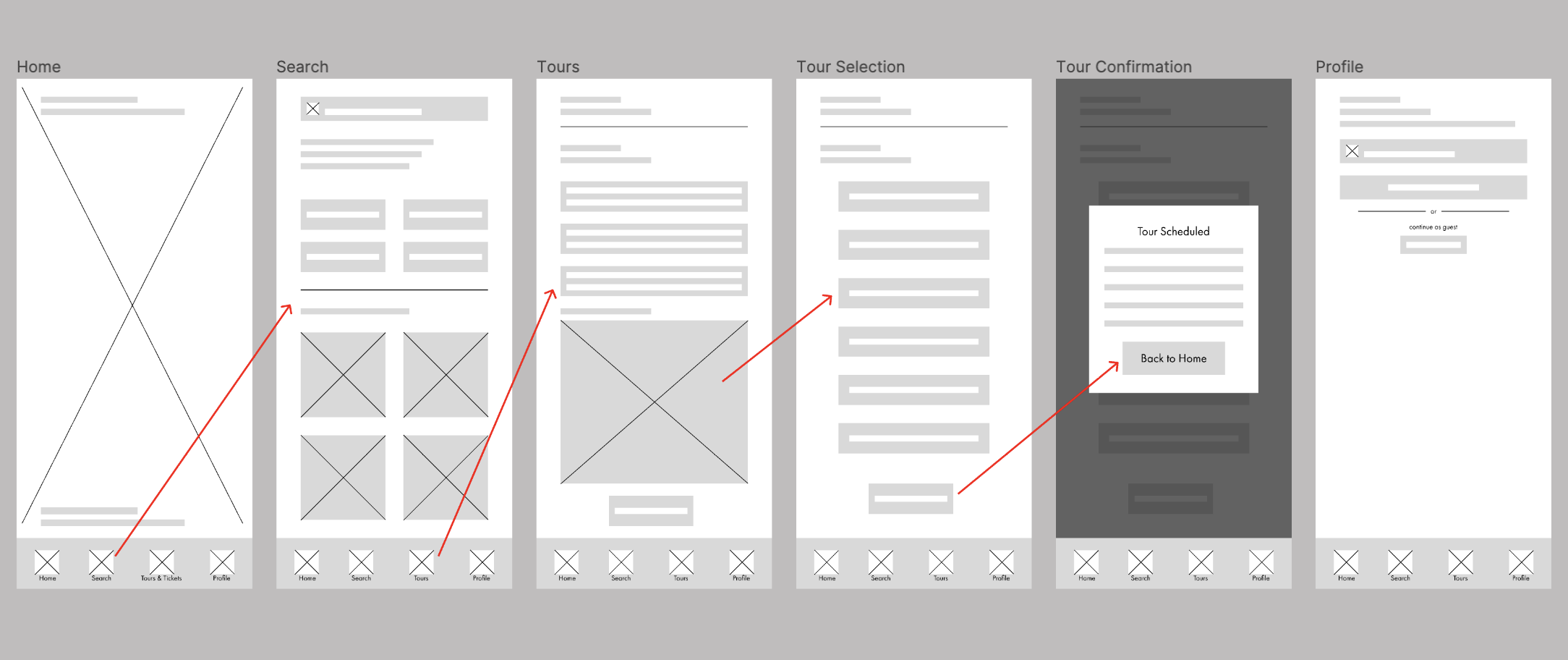
Sticker Sheet
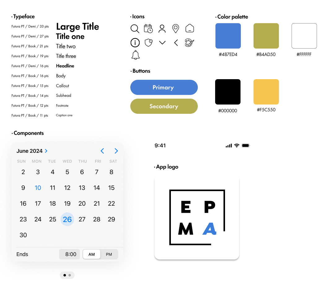
Initially, the UI of the app was going to be color-less. I wanted to take a minimalistic and clean approach. However, after a long though, I included accent colors to make it more fun.
Colors - The main focus of the color palette was to make it accessible, fun, and aesthetically pleasing.
Typography - The typography used in the product emphasizes accessibility and functionality. The use of a sans-serif font give the brand a modern approach.
Designing the Solution: High Fidelity Designs
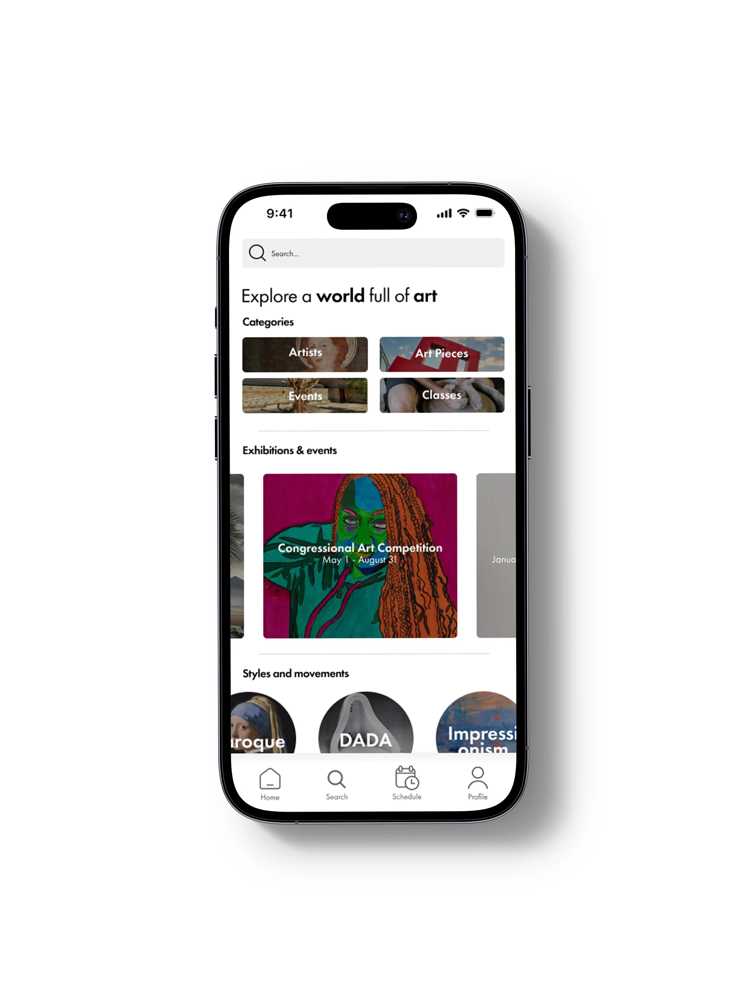
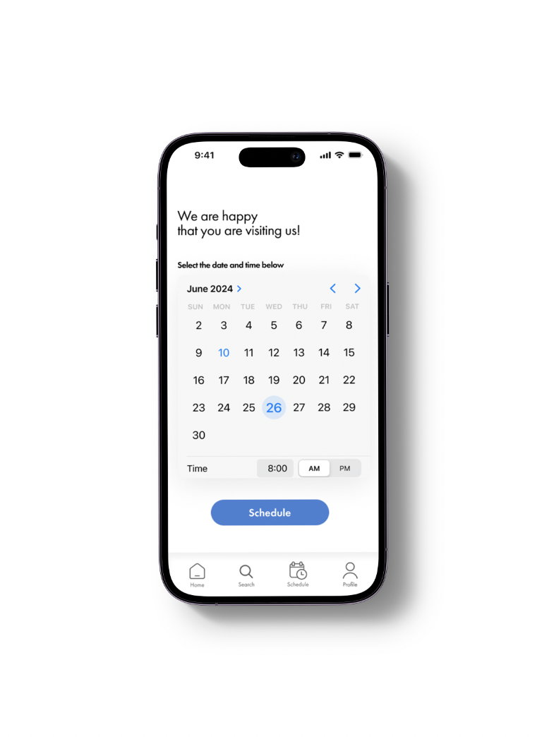
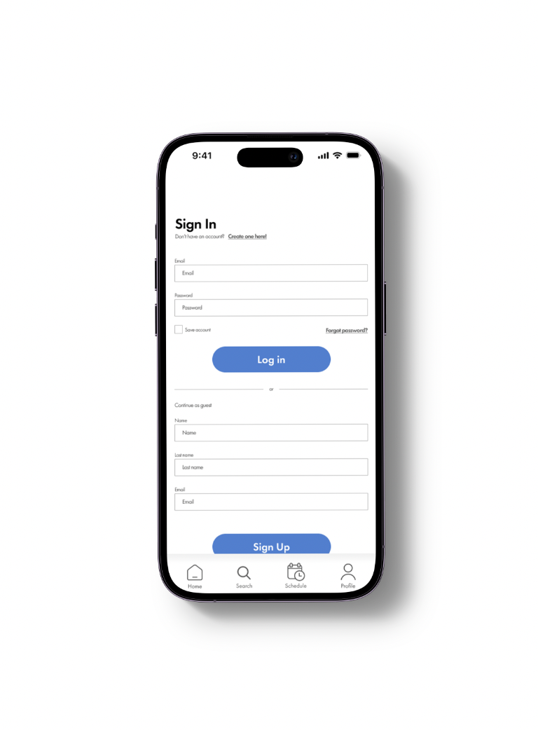
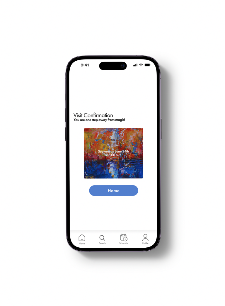
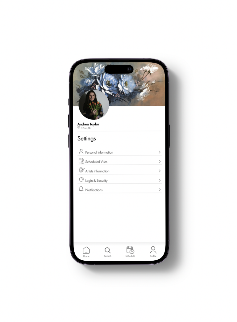
The final product
During testing, I added some colors to the app instead of leaving everything in black and white. Additionally, I adjusted the interactions to make them move in a more organic way.